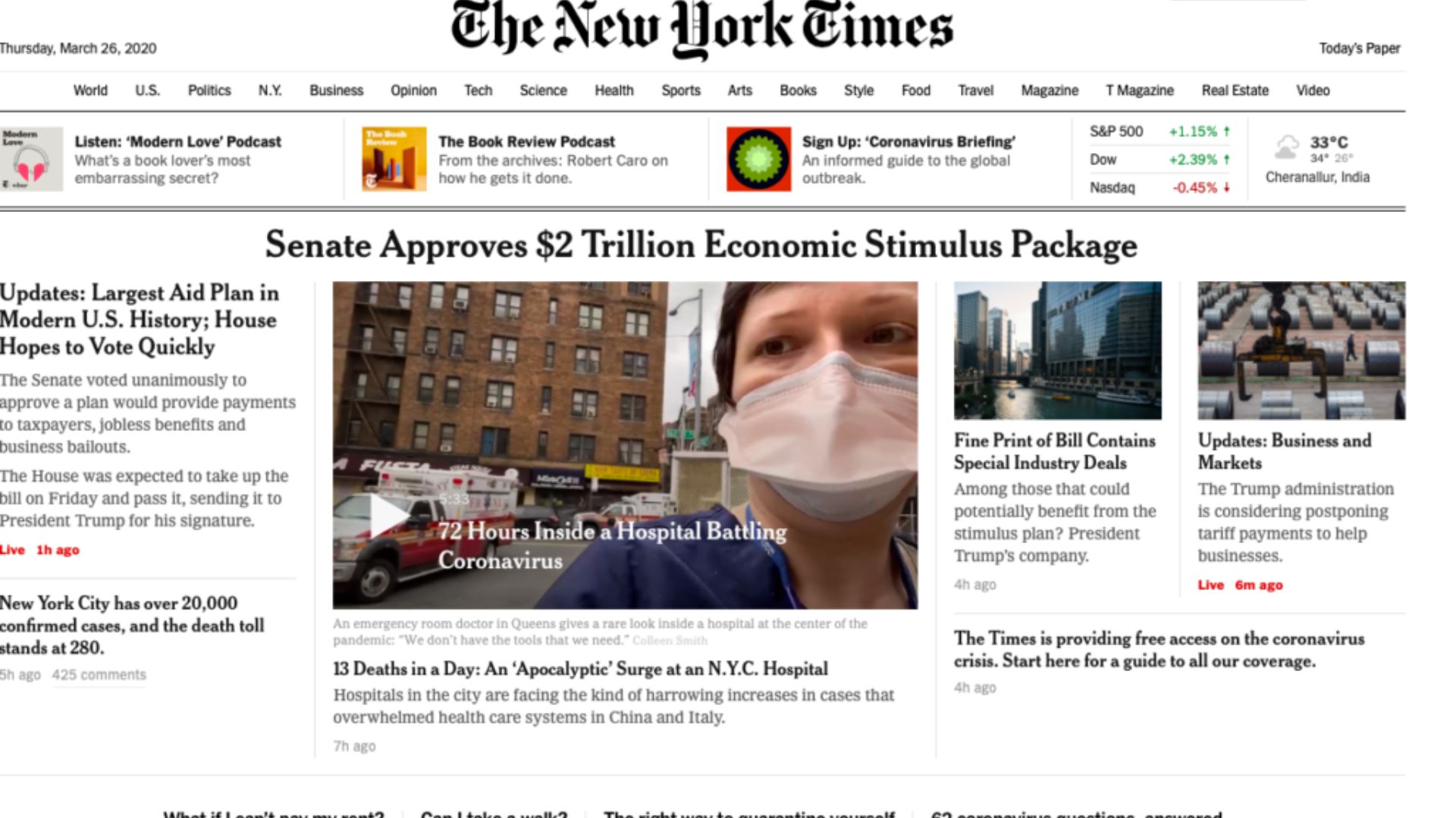
When designing a website, choosing the right layout is crucial for creating a visually appealing and user-friendly experience. Two common website layout options are fixed and fluid designs, each with its own advantages and considerations. Let’s explore the differences between these layouts:
- Fixed Layout:
A fixed layout has a set width that remains constant regardless of the browser window or device screen size. The content and elements on the page maintain a specific size and arrangement. Key points to consider about fixed layouts include:
– Consistency: With a fixed layout, the design remains consistent across different screen sizes, ensuring that the content is presented as intended.
– Control over Design: Fixed layouts allow designers to have precise control over the placement and appearance of elements on the page. This is particularly useful for intricate designs or aligning elements to specific grid lines.
– Limited Adaptability: Fixed layouts may face challenges in adapting to various screen sizes. On smaller devices, content may appear too small, leading to poor readability or the need for excessive scrolling.
- Fluid Layout:
A fluid layout adapts to the available space by proportionally scaling the content and elements based on the browser window or device screen size. Key points to consider about fluid layouts include:
– Adaptability: Fluid layouts respond to different screen sizes, adjusting the content to fit the available space. This can help ensure optimal readability and user experience across devices.
– Responsive Design: Fluid layouts are often associated with responsive design principles, which aim to provide a seamless experience across multiple devices.
– Varied Element Placement: Since elements adjust based on available space, their placement may appear different on various screen sizes. This may require designers to carefully consider how content appears at different breakpoints.
When deciding between fixed and fluid layouts, it’s important to consider factors such as the target audience, the nature of the website content, and the goals of the design. Designers may also opt for hybrid layouts that combine elements of both fixed and fluid designs to strike a balance between control and adaptability.
Additionally, with the increasing importance of mobile responsiveness, fluid or responsive layouts have become more popular to ensure optimal user experiences across a wide range of devices.
In conclusion, the choice between fixed and fluid layouts depends on the specific requirements of the website and the intended user experience. Careful consideration of factors like design control, adaptability, and the user’s device usage habits will help determine the most appropriate layout for a website.


