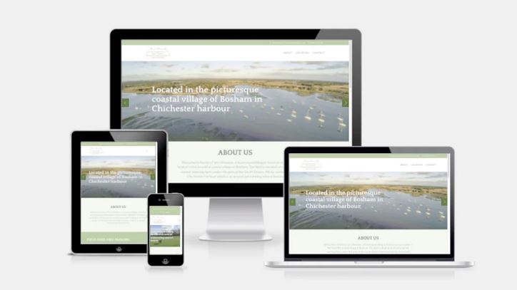
Creating a responsive web design that works seamlessly across all devices is essential to provide a consistent and user-friendly experience. Here are some tips to help you achieve responsive web design:
- Mobile-First Approach: Start designing and developing your website with a mobile-first mentality. This means prioritizing the mobile experience and then scaling up for larger screens. Mobile devices have more constraints, so designing for their limitations helps ensure your website is optimized for smaller screens.
- Fluid Grid System: Use a fluid grid system, such as CSS Grid or Flexbox, to create a flexible layout that adapts to different screen sizes. This allows your website to automatically adjust and reflow content as the screen size changes.
- Responsive Images: Optimize your images for different devices by using responsive image techniques. Implement tools like the srcset attribute or use CSS media queries to deliver appropriately sized images based on the device’s resolution.
- Media Queries: Utilize CSS media queries to apply different styles and layouts based on the device’s screen width. Media queries allow you to adjust font sizes, spacing, and overall layout to optimize the user experience for each screen size.
- Breakpoints: Set breakpoints in your design where the layout should change to accommodate various screen sizes. These breakpoints determine when specific CSS rules or layouts should be triggered to ensure an optimal display.
- Touch-Friendly Elements: Consider mobile-specific interactions and ensure your website’s elements are touch-friendly. Use larger, easily tappable buttons or links, and provide ample spacing between elements to avoid accidental taps on smaller screens.
- Performance Optimization: Optimize your website’s performance by minimizing file sizes and reducing the number of HTTP requests. Compress assets, leverage browser caching, and prioritize critical content to ensure fast loading times on all devices.
- Test on Multiple Devices: Regularly test your design on a variety of devices, including smartphones, tablets, and desktops, to ensure proper functionality and visual appeal. Use device emulators, responsive design testing tools, or conduct real-world testing to identify any issues and make necessary adjustments.
- Content Prioritization: Prioritize content based on its importance for mobile users. Ensure that crucial information is easily accessible and visible, even on smaller screens. Consider hiding non-essential elements or organizing them hierarchically to prevent cluttering the interface.
- User Feedback and Iteration: Actively gather feedback from users and analyze website analytics to identify areas for improvement. Regularly iterate and refine your responsive design to address user needs and optimize the user experience across all devices.
By following these tips, you can create a responsive web design that adapts beautifully to various devices, ensuring a seamless and enjoyable user experience for all visitors to your website.